Three Problems — and a Solution — for Data Viz in MERL and ICT4D
Guest post by Amanda Makulec, MPH, Data Visualization Society Operations Director
Just about everyone I know in the ICT4D and MERL communities has interacted with, presented, or created a chart, dashboard, infographic, or other data visualization. We’ve also all seen charts that mislead, confuse, or otherwise fall short of making information more accessible.
The goal of the Data Visualization Society is to collect and establish best practices in data viz, fostering a community that supports members as they grow and develop data visualization skills. With more than 11.5K members from 123 countries on our first birthday, the society has grown faster than any of the founders imagined.
There are three reasons you should join the Data Visualization Society to improve your data visualizations in international development.
Self-service data visualization tools are everywhere, but that doesn’t mean we’re always building usable charts and graphs.
We’ve seen the proliferation of dashboards and enthusiasm for data viz as a tool to promote data driven decisionmaking.
Just about anyone can make a chart if they have a table of data, thanks to the wide range of tools out there (Flourish, RAWgraphs, Datawrapper, Tableau, PowerBI…to name a few). Without a knowledge of data viz fundamentals though, it’s easy to use these tools to create confusing and misleading graphs.
A recent study on user-designed dashboards in DHIS2 (a commonly used data management and analysis platform in global health) found that “while the technical flexibility of [DHIS2] has been taken advantage of by providing platform customization training…the quality of the dashboards created face numerous challenges.” (Aprisa & Sebo, 2020).
The researchers used a framework from Stephen Few to evaluate the frequency of five different kinds of ‘dashboard problems’ on 80 user-designed sample dashboards. The five problem ‘types’ included: context, dashboard layout, visualization technique, logical, and data quality.
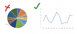
Of the 80 dashboards evaluated, 69 (83.1%) had at least one visualization technique problem (Aprisa & Sebo, 2020). Many of the examples shared in the paper could be easily addressed, like transforming the pie chart made of slices representing points in time into a line graph.

With so many tools at our fingerprints, how can we use them to develop meaningful, impactful charts and interactive dashboards? Learning fundamentals of data visualization is an excellent place to start, and DVS offers a free-to-join professional home to learn those fundamentals.
Many of the communities that exist around data visualization are focused on specific tools, which may not be relevant or accessible for your organization.
In ICT4D, we often have to be scrappy and flexible. That means learning how to work with open source tools, hack charts in Excel, and often make decisions about what tool to use driven as much by resource availability as functionality.
There are many great tool specific communities out there: TUGs, PUGs, RLadies, Stack Overflow, and more. DVS emerged out of a need to connect people looking to share best practices across the many disciplines doing data viz: journalists, evaluators, developers, graphic designers, and more. That means not being limited to one tool or platform, so we can look for what fits a given project or audience.
After joining DVS, you’ll receive an invite to the Society’s’ Slack, a community “workspace” with channels on different topics and for connecting different groups of people within the community. You can ask questions about any data viz tool on the #topic-tools channel, and explore emerging and established platforms with honest feedback on how other members have used them in their work.
Data visualization training often means one-off workshops. Attendees leave enthusiastic, but then don’t have colleagues to rely on when they run into new questions or get stuck.
Data visualization isn’t consistently taught as a foundation skill for public health or development professionals.
In university, there may be a few modules within a statistics or evaluation class, but seldom are there dedicated, semester long classes on visualization; those are reserved for computer science and analytics programs (though this seems to be slowing changing!). Continuing education in data viz is usually short workshops, not long-term mentoring relationships.
So what happens when people are asked to “figure it out” on the job? Or attend a two day workshop and come away as a resident data viz expert?
Within DVS, our leadership and our members step up to answer questions and be that coach for people at all stages of learning data visualization. We even have a dedicated feedback space within Slack to share examples of data viz work in progress and get feedback.
DVS also enables informal connections on questions on a wide range of topics. Go to #share-critique, for posting work-in-progress visualizations and seeking feedback from the community. We also host quarterly challenges where you can do hands-on practice with provided data sets to develop your data viz skills and have plans for a formal mentorship program to launch in 2020.
Join DVS today to get its benefits – members from Africa, Asia, and other underrepresented areas are especially encouraged to join us now!
Have any questions? Or ideas on ways DVS can support our global membership base? Find me on Twitter – my DMs are open.
You might also like
-
What’s happening with GenAI Ethics and Governance?
-
Join the AI and African Evaluation Working Group Meet ‘n’ Mix Session on May 7!
-
Hands on with GenAI: predictions and observations from The MERL Tech Initiative and Oxford Policy Management’s ICT4D Training Day
-
When Might We Use AI for Evaluation Purposes? A discussion with New Directions for Evaluation (NDE) authors